


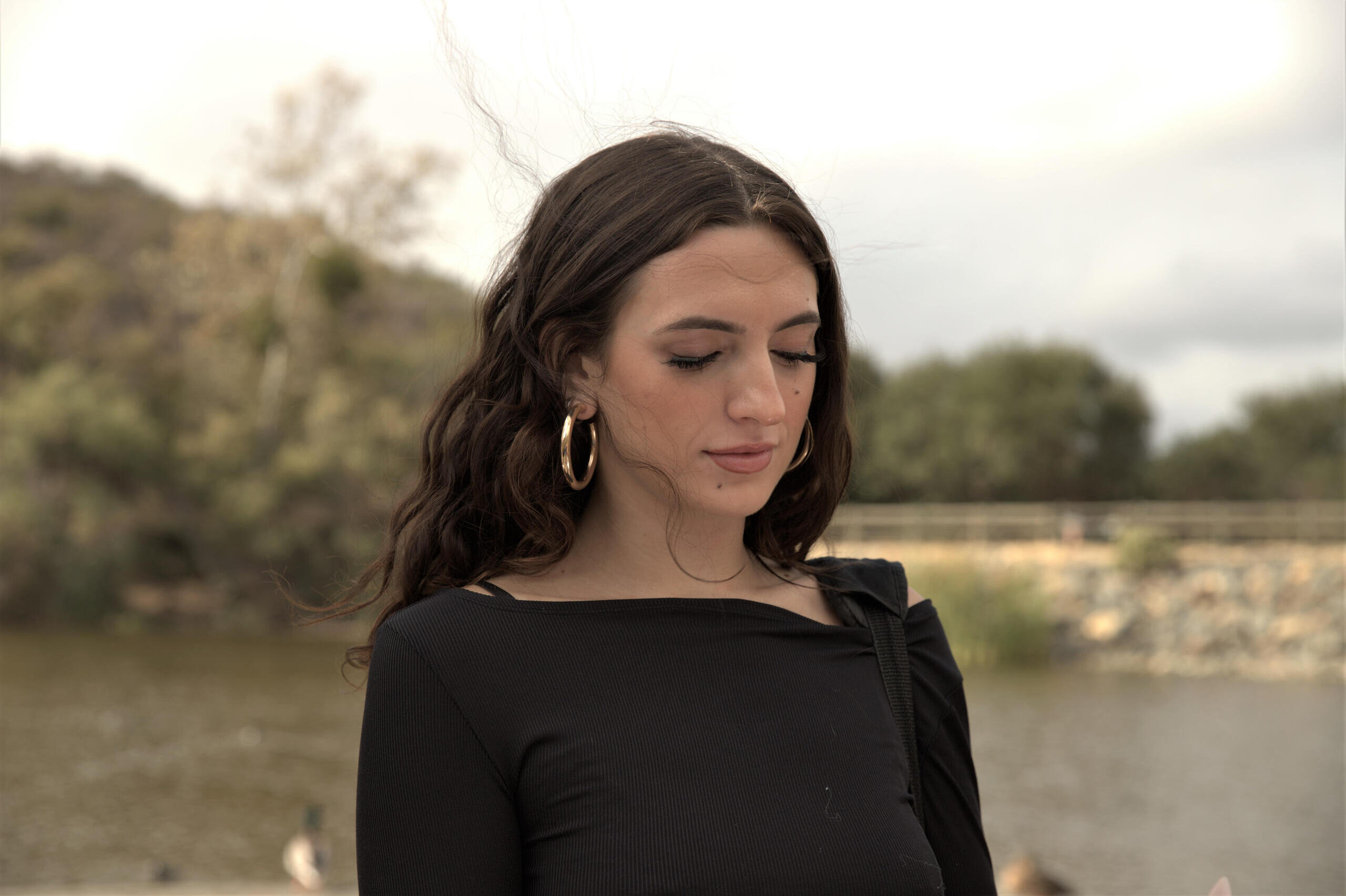
Photography by Nicole: Weapon of choice is a Canon DLSR.


Instagram Posts
Instagram carousels function as an important tool for sharing information, engaging with clients, and building a strong customer base. The utilization of a three-post carousel enhances the ability to share diverse content seamlessly. The first post, featuring a relevant video, not only captures attention but also conveys essential information. Accompanied by a short and informative caption with a compelling call to action, it prompts immediate engagement. The second post delves into introducing the essence of our company, creating a personal connection with the audience. Lastly, the third post strategically outlines the range of services we provide, fostering a comprehensive understanding. This dynamic carousel approach maximizes the platform's potential, ensuring effective communication and audience interaction for the growth and consolidation of our customer base.
Instagram Stories
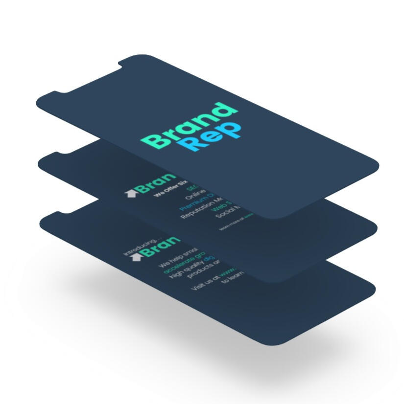
In crafting the animated Instagram stories, I seamlessly integrated the branding elements to bring forth a dynamic visual experience. I ensured that the unique text styles, logo, and color schemes flowed cohesively, creating a recognizable brand identity within each frame. This strategic fusion not only upheld consistency with the established brand image but also heightened the storytelling aspect of the content, establishing a memorable and engaging connection with BrandRep's audience. Through this creative process, the animated Instagram stories have evolved into a potent tool for sharing the brand narrative in a visually compelling and dynamic manner.
Logo and Branding


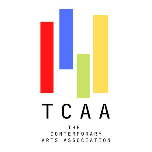
The choice of blue and green hues in the logo design was deliberate, symbolizing reliability and safety. Blue conveys trust and dependability, instilling confidence in BrandRep's clients, while green signifies growth and harmony, reflecting a balanced and sustainable approach. These colors not only evoke a sense of security but also create a visually pleasing experience for the audience. The incorporation of an arrow in the logo, pointing upward, is a deliberate choice to symbolize growth and progress. It embodies BrandRep's commitment to propelling clients towards success and continuous advancement, emphasizing the upward trajectory we aspire to achieve together.
Instagram stories and A-frames created during my time at California State University, San Marcos ASI.
Typographic Graphics created for Gofynder.com for use on Social Media, Instagram, Facebook.
Inpsirational Quotes for ChickTech Orange County, a non-profit providing workshops in STEM for girls K-12.